Pride at OverEasy
This year, we’ve developed Pride creative for:
ACLU of Oregon
Eastside Kettlebell Collective
Oregon Public Broadcasting
PDX
(2026)
Illustration & Pride
Pride work is where a studio's real values show up, or don't. Anyone can drop a rainbow on a logo in June. What's harder, and what actually matters to the organizations doing this work year-round, is design that treats queer and trans joy as the subject, not the decoration: illustration with a point of view, identity systems that hold up across a parade banner and a phone screen, and craft that says these communities are worth the good stuff.
Over the past year, OverEasy has made that kind of work for three very different Oregon institutions: a civil-rights organization, a public media network, and a queer-friendly gym. Different audiences, different tones, one throughline: we bring genuine warmth and serious craft to work about joy, and we build it to live everywhere the community will actually see it.
ACLU of Oregon Trans Joy
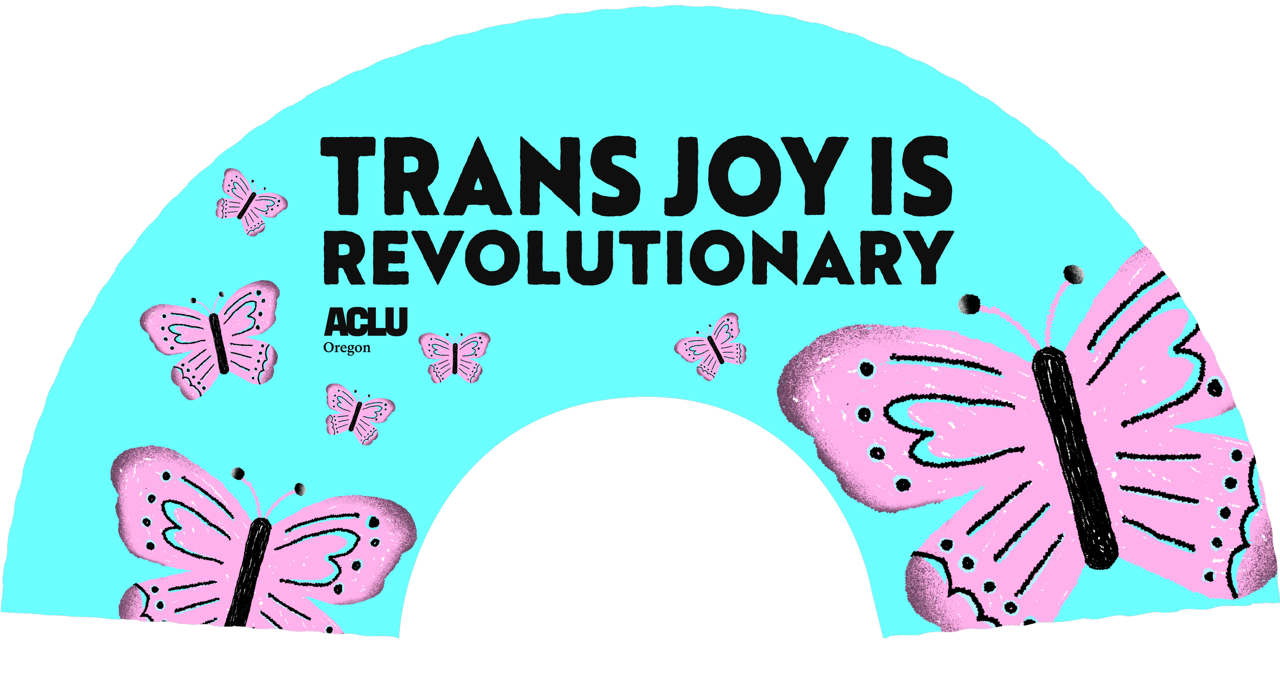
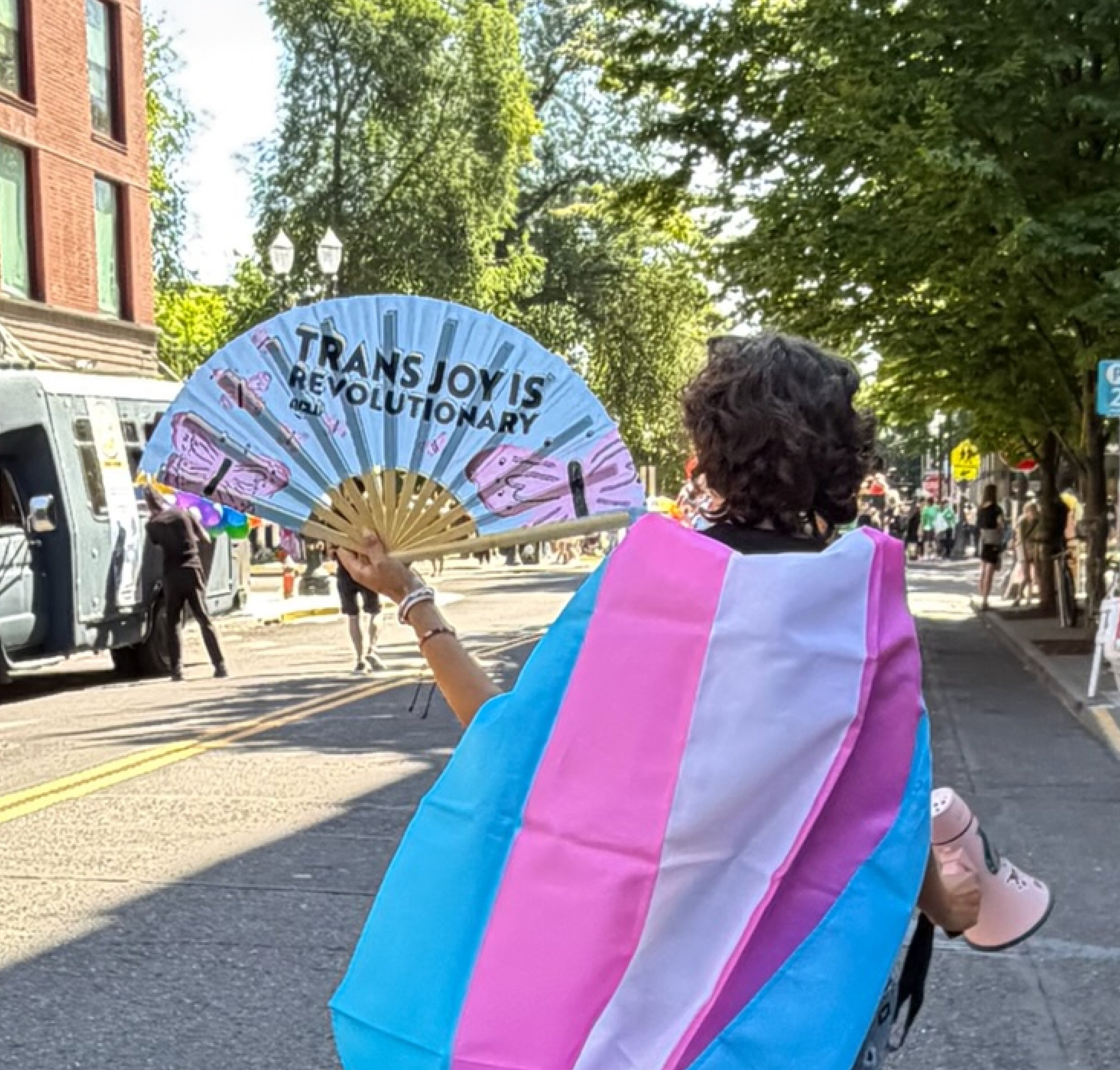
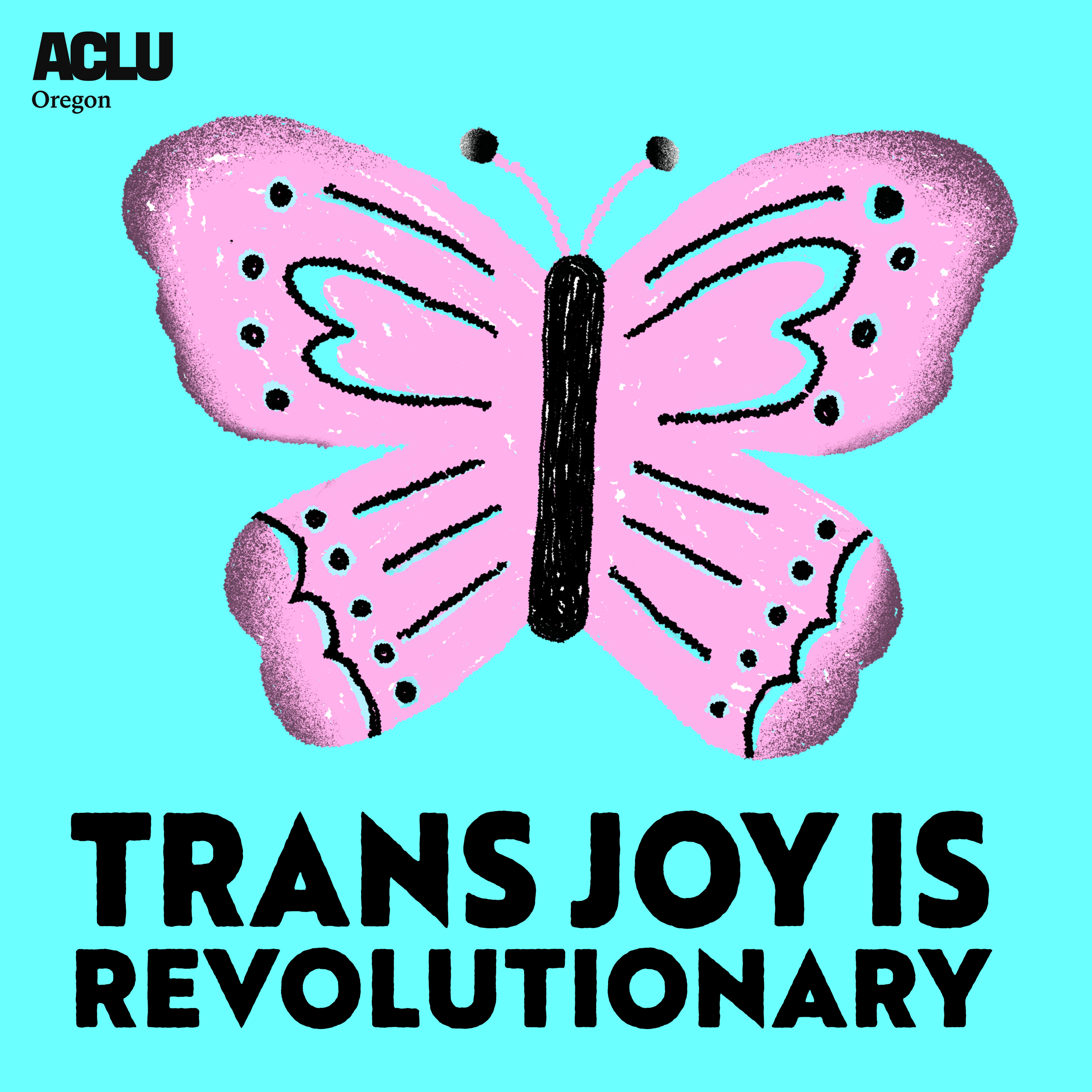
OverEasy created the original illustration and lettering for the 'Trans Joy is Revolutionary' campaign, hand-drawn butterflies in the trans-flag palette, a bold, chunky headline, and a composition designed to read on a folding hand fan: legible when closed, complete when open. The same artwork extended cleanly to stickers and other merch, so one illustration carried the whole program.
Every choice served both message and use: high-contrast lettering that reads across a crowded street, a color story rooted in the trans flag, and a hand-drawn quality that feels human and celebratory rather than corporate.
Pride at Eastside Kettlebell Collective
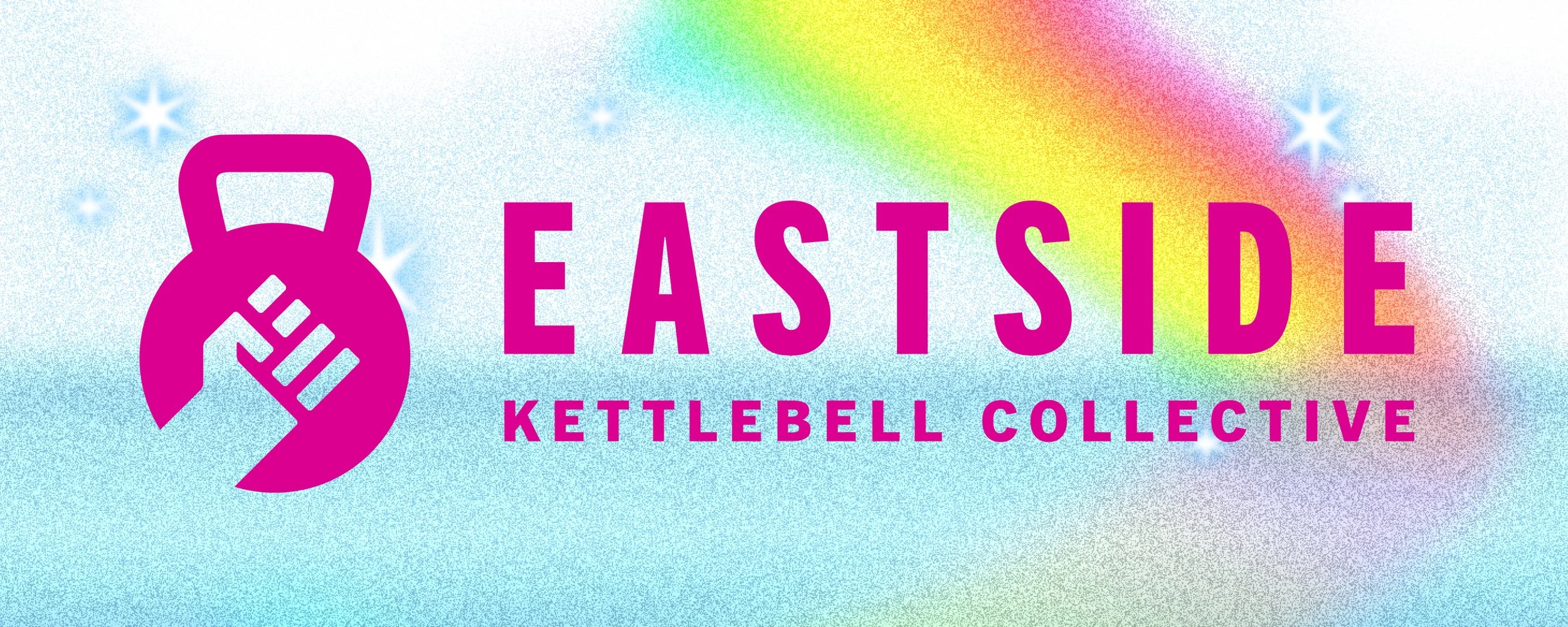
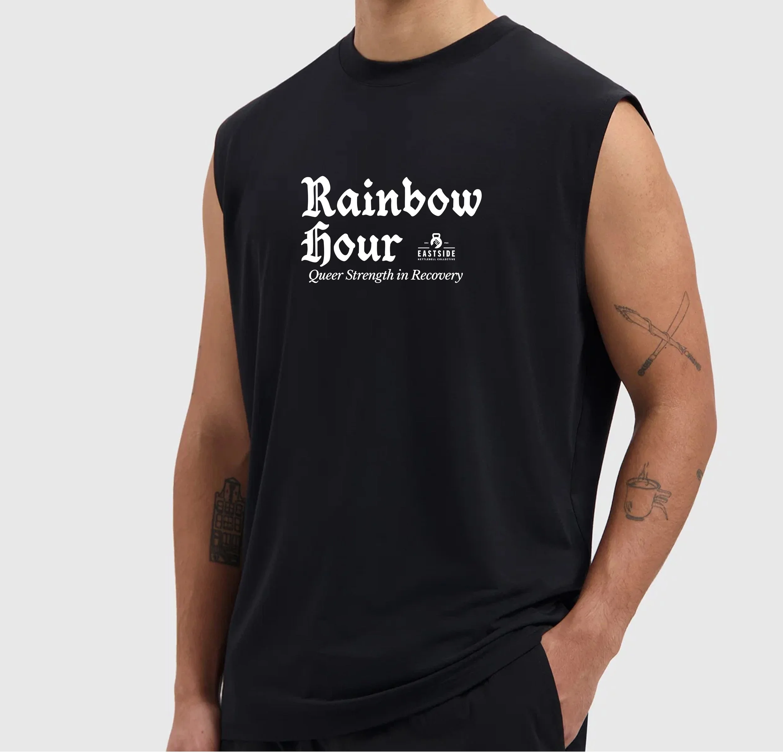
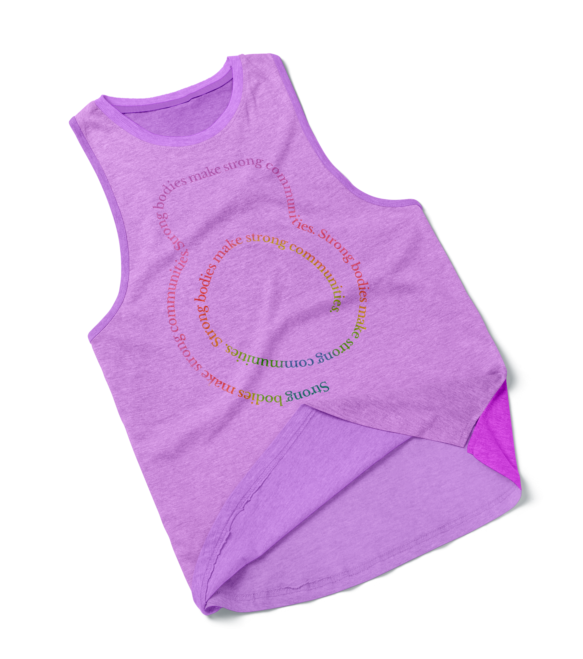
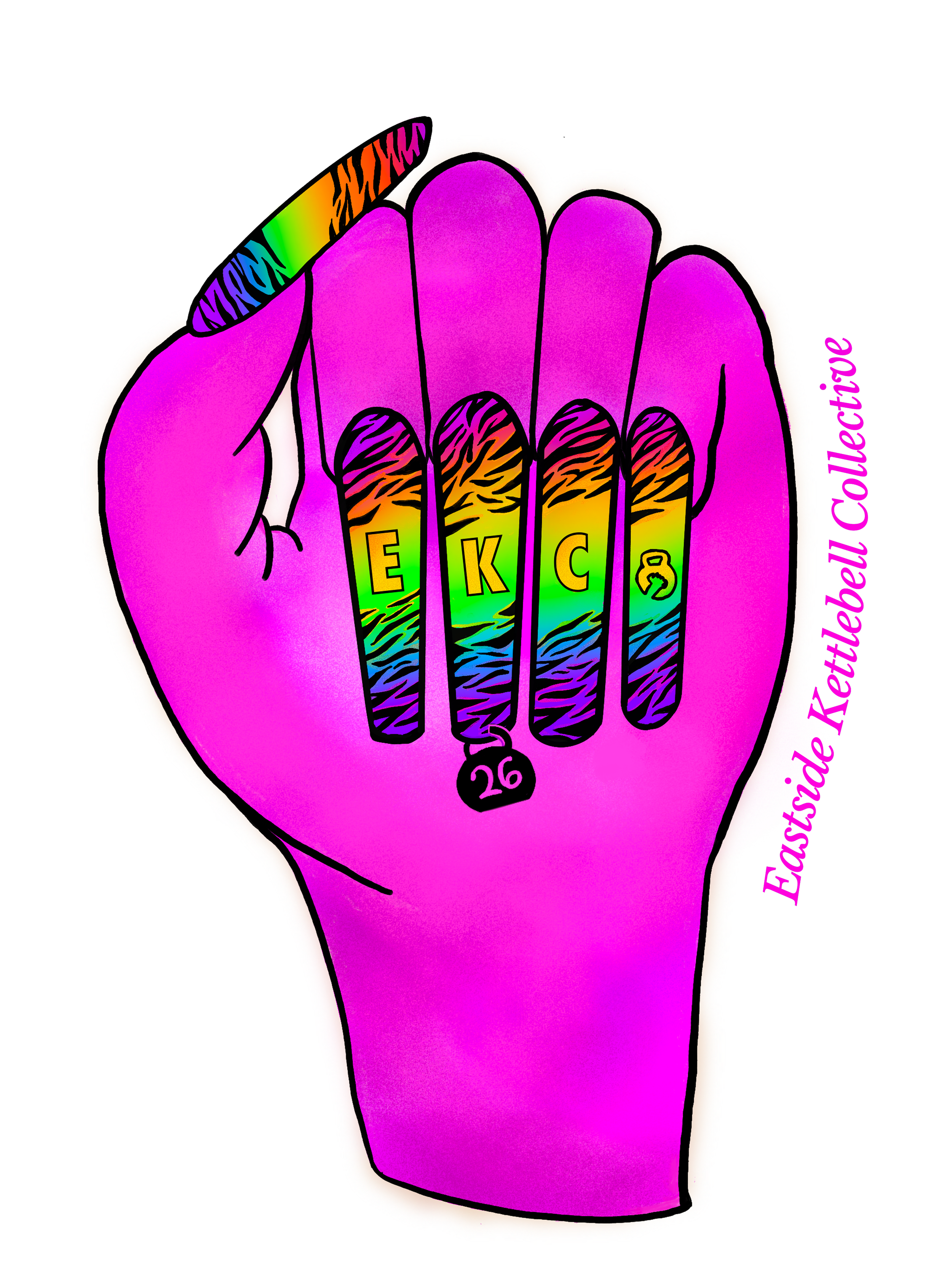
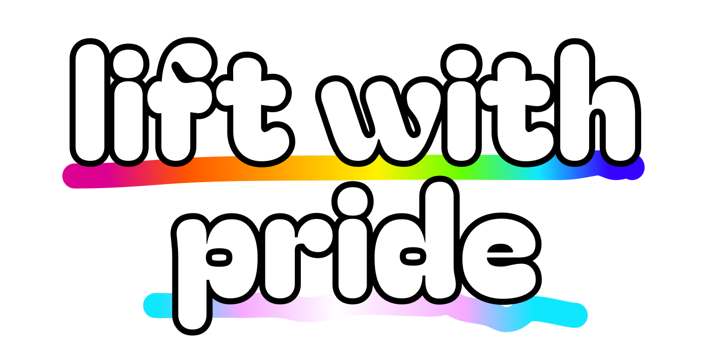
OverEasy delivered a range of brand and Pride illustrations for EKC, the vivid, high-saturation illustration of a rainbow-manicured hand throwing up the collective's sign; the sparkly rainbow 'Eastside Kettlebell Collective' banner; and Pride apparel including 'Rainbow Hour — Queer Strength in Recovery' and 'Lift with Pride.' Each piece pushes color and personality hard while staying a coherent brand.
The work spans registers on purpose: a clean blackletter-and-serif apparel treatment for the recovery-focused 'Rainbow Hour' piece, and a maximalist, unapologetically loud rainbow illustration for the hand mark, same brand, different volume, each matched to its use.
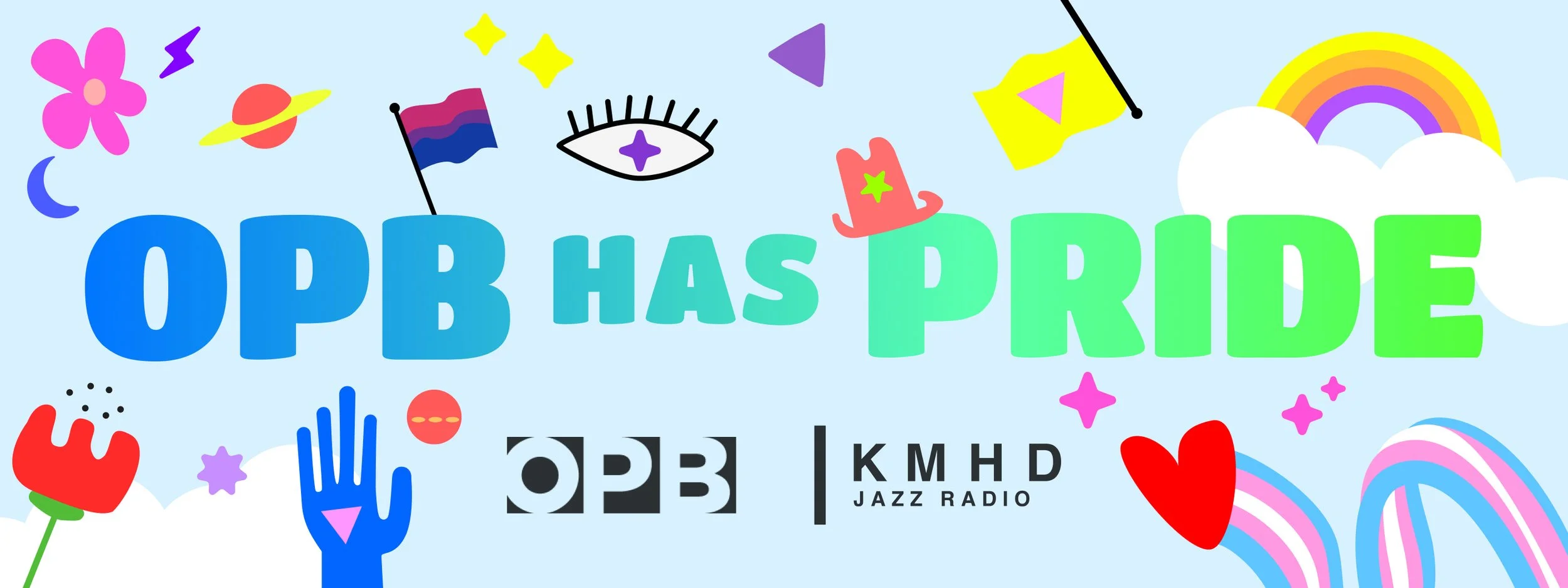
Oregon Public Broadcasting has Pride
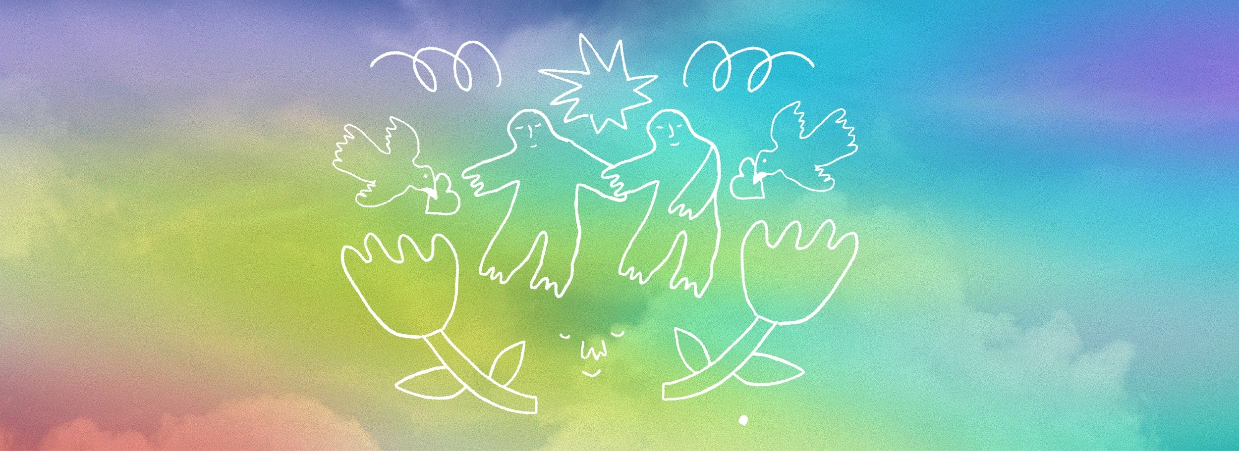
OverEasy developed the 'OPB has Pride' visual system, a playful illustrated icon set (Pride and trans flags, florals, sparkles, hands, hearts, a wink of an eye, line-drawn dancing figures), and a flexible layout kit that scaled from a square sticker to a wide web banner. The system was built as a kit of parts, not a single lockup: the same visual language recomposes for each placement while staying on-brand.