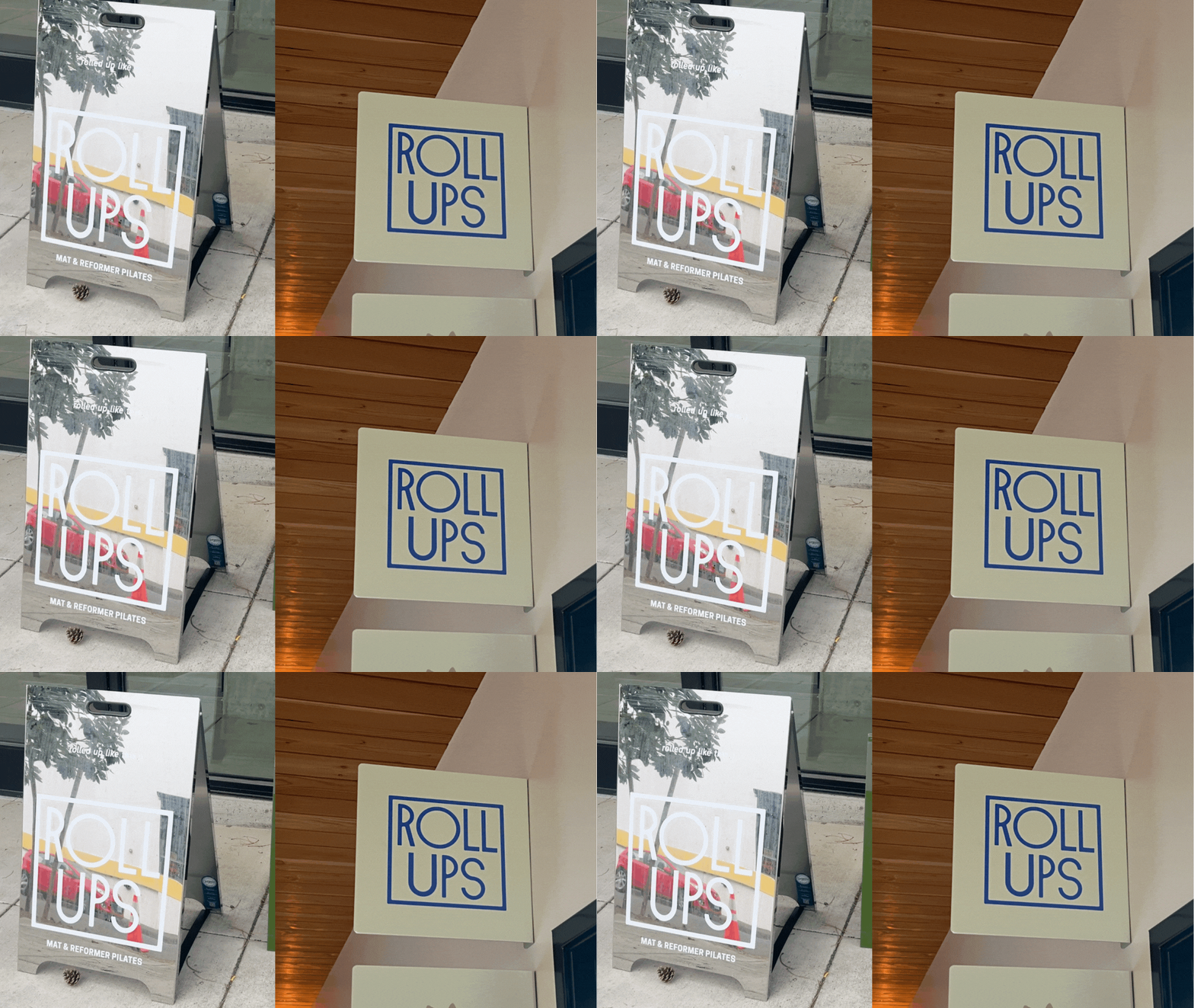
Roll Ups
PDX (2024)
Branding ✷ Creative Direction ✷ Community Design
Roll Ups came to us needing a visual identity that actually felt like the studio: warm, energetic, and rooted in community. Working within their existing logo, we partnered closely with the owner from day one, digging into the details that make Roll Ups Roll Ups, so the rebrand wouldn't just look good; it would feel true.
The Snag
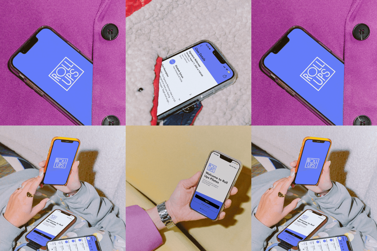
A great studio experience doesn't always translate online. Roll Ups had the energy in the room but not yet on the grid—no unified look, no consistent voice, and a digital presence that didn't match the atmosphere people felt the second they walked in. We needed to close that gap and build a visual language around their existing logo that was flexible enough to work everywhere, from a single Instagram post to a full event campaign.
The Work
We started with research and exploration, unpacking Roll Ups' values, audience, and energy before landing on a cohesive look and feel—one that felt modern and approachable without losing the studio's warmth.
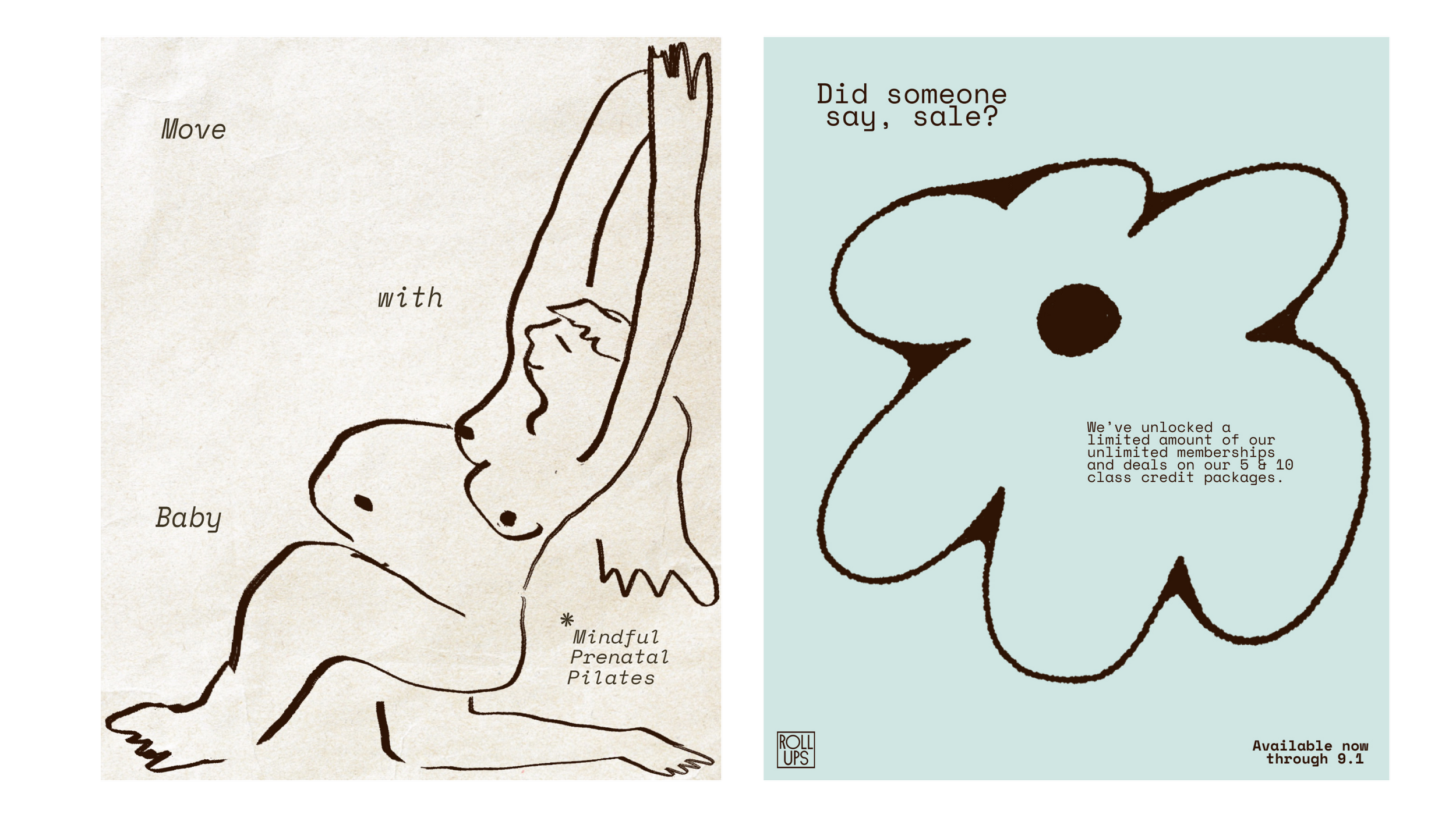
From there, we built out branded social content and visual assets, then took things off the screen: documenting studio events through photography and video to capture the movement, community, and atmosphere that make Roll Ups special. We designed promotional posters and cut short-form video reels to support those events, making sure every post, poster, and pixel felt like the same brand.
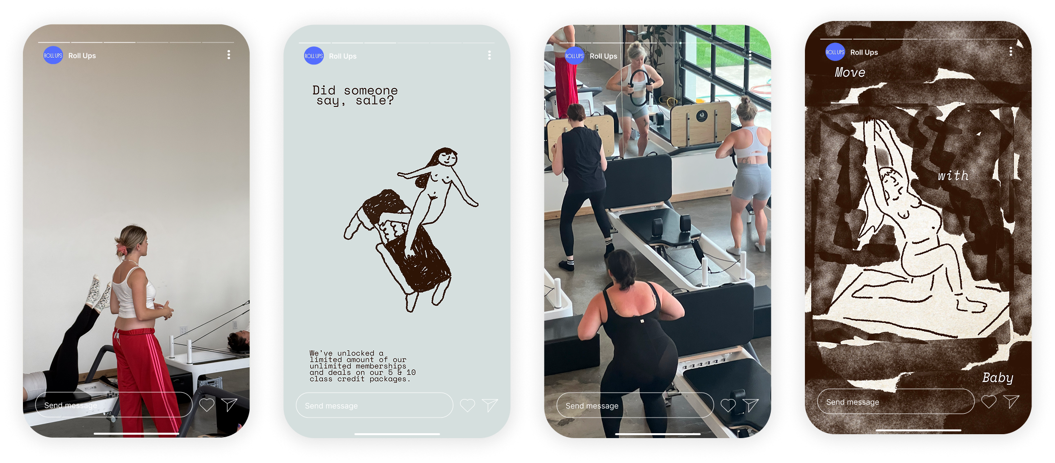
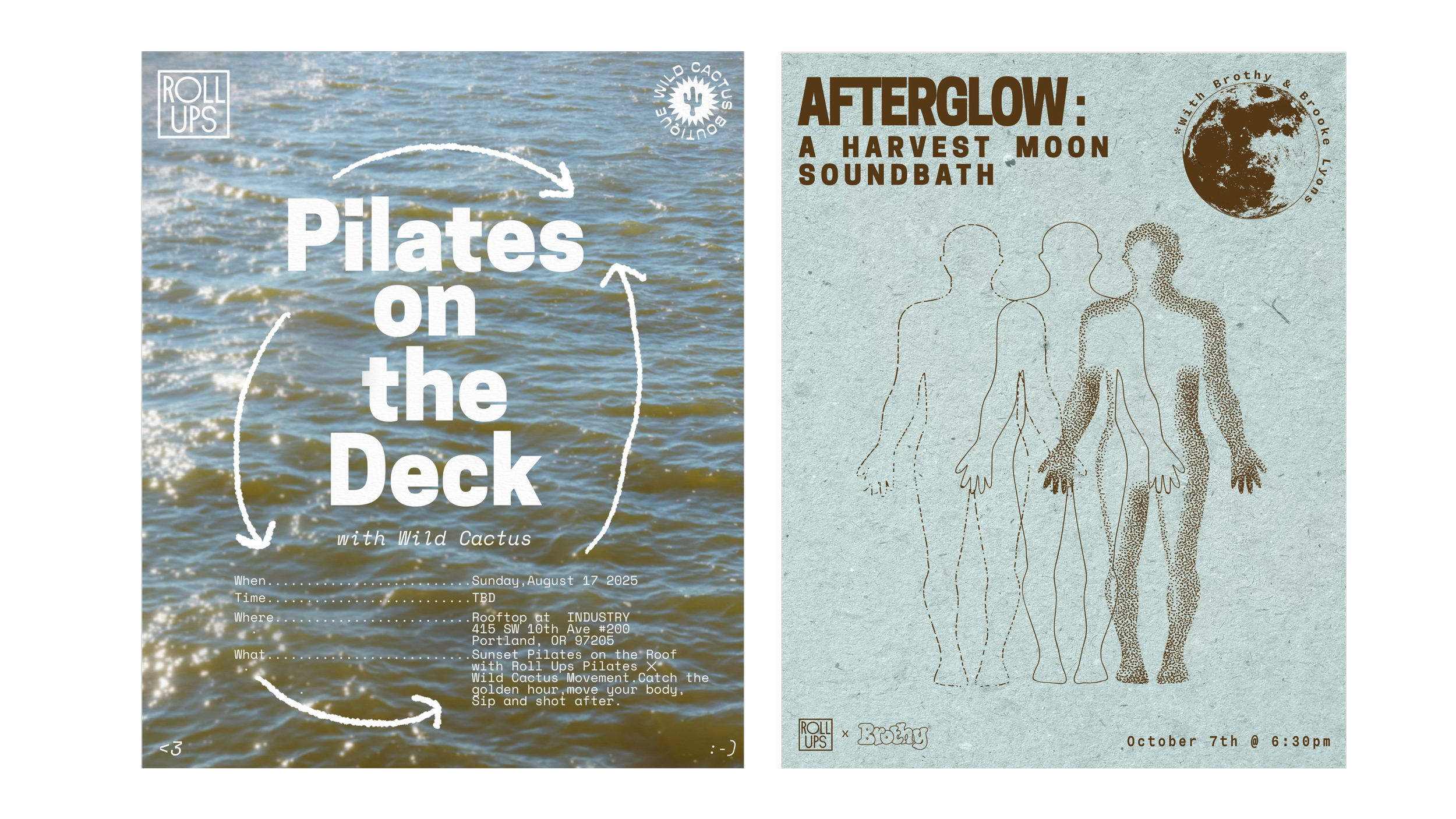
The result is a brand presence that holds together everywhere it shows up—online and in-person. Strategy, visual identity, and content creation came together to give Roll Ups a stronger, more consistent voice, one that now shows up as confidently on a phone screen as it does on the studio floor.
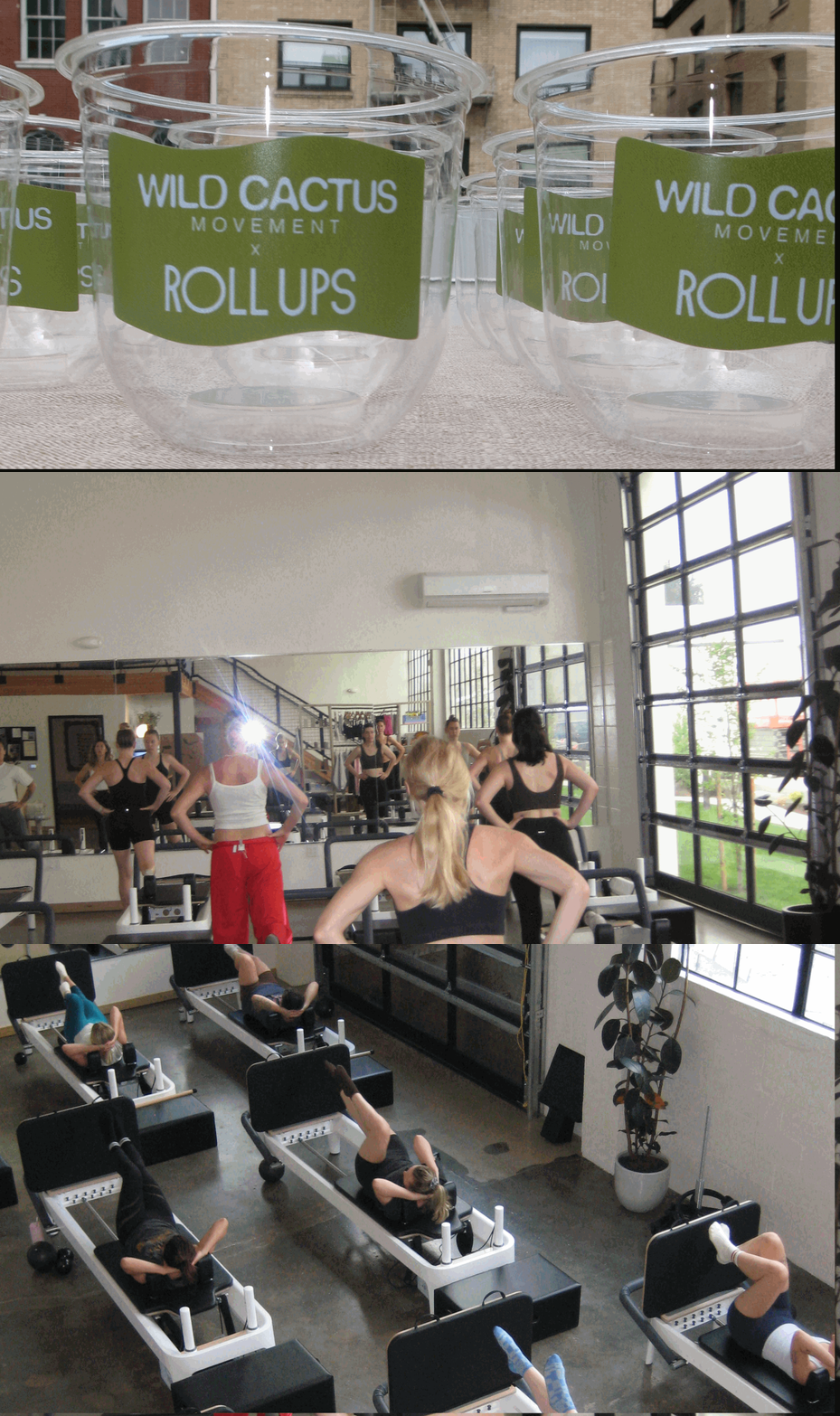
The Result